ATTIRE is a fashion magazine that focuses on the new styles, fashion and trends and is published in both print and digital platforms. I have done both UX and UI design for this magazine. For the structure, I set up the grid in a way that makes the layout looks appealing while at the same time, allowing the designers to break it based on what is needed. Colour-wise it is open to any colour scheme depending on the nature of essays/articles or advertisements.
For typefaces, I have chosen "Bodoni Light” and “Regular" for headlines and subtitles, respectively. As Bodoni looks tall, thin, along with its beautiful serif, it fulfills the chic and fancy style of the magazine. For the body and content, I have chosen a san-serif typeface “Myriad Pro Regular” for its readability, especially on smaller digital platforms like mobile devices.
Below is a sample layout of an issue that is focused on Recycling Fashion.
Cover
I have designed the content page around the idea of sewing patterns and sewing stitches.
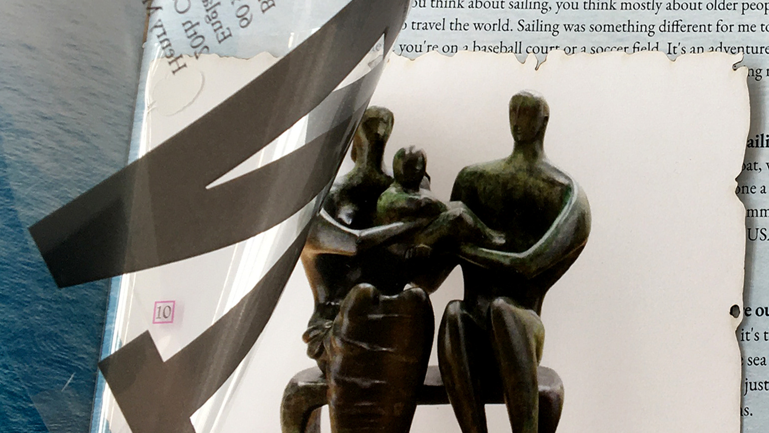
For this article, the creative element is the crumpled paper.
Mobile layout
